Tearing up the Rulebook – 12 Photography Rules and When to Break Them
by Alex W.
We humans love to define things in a strict and orderly fashion. It’s easier that way, and we try to do it everywhere.
Sometimes, it’s just not the best way to do things.
I find photography to be one of those things. Well known theories on the aesthetics of art and photography have been moulded and shaped into the often cited “Rules of Photography”. Photography societies treat these like syllabuses that the photographer mustn’t deviate from, and as a result of this a plethora of formulaic photographers churn out predictable and uninspiring images.
It might sound like I’m being overly critical of such a helpful resource for beginners, and I maybe am. The fault is not with these ‘rules’ themselves, but more the way some refuse to deviate from the norm and as a result become somewhat stunted in their creativity.
You know what they say: Rules are made to be broken.
You Might Like… The Photographer’s Glossary – A Guide to Common Photography Terms
What are these Photography Rules?
Before we discuss breaking the rules, it might help to know what rules we’re talking about.
Most of them (the ones related to composition) have their foundations in the art world, and are the result of centuries of studying artwork and determining what exactly looks good.
And they work! Many are backed up by science, and they give the beginner photographer something specific to aim for as you learn what looks good. Learning about these guidelines will act as the foundation of your photographic knowledge for years to come, so they’re well worth looking into. We’ve discussed them plenty of times on Click and Learn Photography, with a few of the more notable articles below.
Beginner’s Guide to Photography Composition
5 More Tips to Improve Your Photography Composition
8 Quick Tips to Transform Your Landscape Photography
How to Use Leading Lines to Improve Your Composition
Sounds like I’m contradicting myself, right?
Here’s the point – They only become a problem when they are treated as rules.
If one makes sure to follow the rule of thirds in every image, ensuring that there is a sufficient leading line in their landscape and only ever venturing out during the Golden Hours do you know what you end up with? A boring and repetitive portfolio of images.
Treating this admittedly very helpful guidelines for composition and photography like steadfast rules to adhere to at all times doesn’t just stifle creativity, it destroys it. How can you be creative when you’re trying to follow half-a-dozen rules for every single photograph you take?
This, in my opinion, is why we have to learn when to completely ignore the self-imposed photography rulebook. Tear it up, and invite creativity and intuition back into your photography!
Photography Rule #1 – Rule of Thirds
What is it?
The rule of thirds is perhaps the most well known of the so-called photography rules, and it has a very solid foundation in science and art. The theory is that dividing your image up into nine equal rectangles, as below, and placing your main focal points on the intersecting lines creates a more balanced and aesthetically pleasing composition.
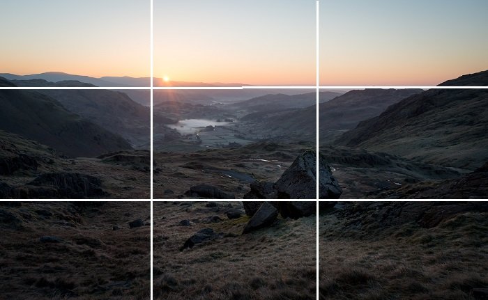
When to break it
The rule of thirds is well worth learning when starting out, and it often works out very well. However, always placing your subjects on these intersecting planes leads to a predictable and unimaginative portfolio. It’s obvious to even the untrained photographic eye if all of your compositions are almost identical.
Once you’re a bit further into your photography journey the rule of thirds begins to hold you back. You know that in many cases (see Photography Rule #13) it’s not ideal to put your subject dead-centre, but that doesn’t mean you have to adhere to the rule of thirds. Place it nearer the edge of your frame, or just very slightly off-centre. This works particularly well for images where you have a single focal point and are trying to focus on a more minimalistic image.
The same goes for the horizon, which the rule of thirds states should be place on either the top third or bottom third line. These strict guidelines do nothing but harm your photography.
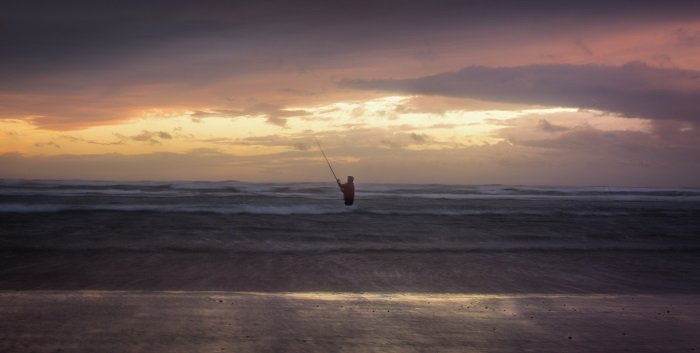
Ignoring the rule of thirds, I placed this wading fisherman away from those intersecting lines and put the horizon near the centre to give equal weight to the beautifully atmospheric sky and the layers of waves.
For example, photographs that feature those perfect reflections in water can definitely work with the horizon placed dead-centre. Sometimes it pays to exclude the horizon completely and just photograph the land, while an extremely dramatic sky can be enhanced by placing the horizon very close to the bottom of the frame and emphasising the ‘size’ of that sky.
The possibilities are endless for photography composition, so experiment!
Photography Rule #2 – Leading Lines
What is it?
Another very traditional and usually useful compositional rule is that of leading lines. The theory is that we want to use features in our composition that draw the viewer’s eye into the image and towards the main subject.
These can be physical features such as fence lines or walls, or they can be more implied and abstract such as shadows or even the direction a person or animal is looking.
As you can see from the image below, these lines invite the viewer to follow them along towards the main subject of the photograph. They give an enhanced sense of depth to the image and imply three dimensionality, and also allow you as the photographer to control how the viewer’s eye moves around the image.
As with all of these rules though, adhering to the norm isn’t always the best thing to do.
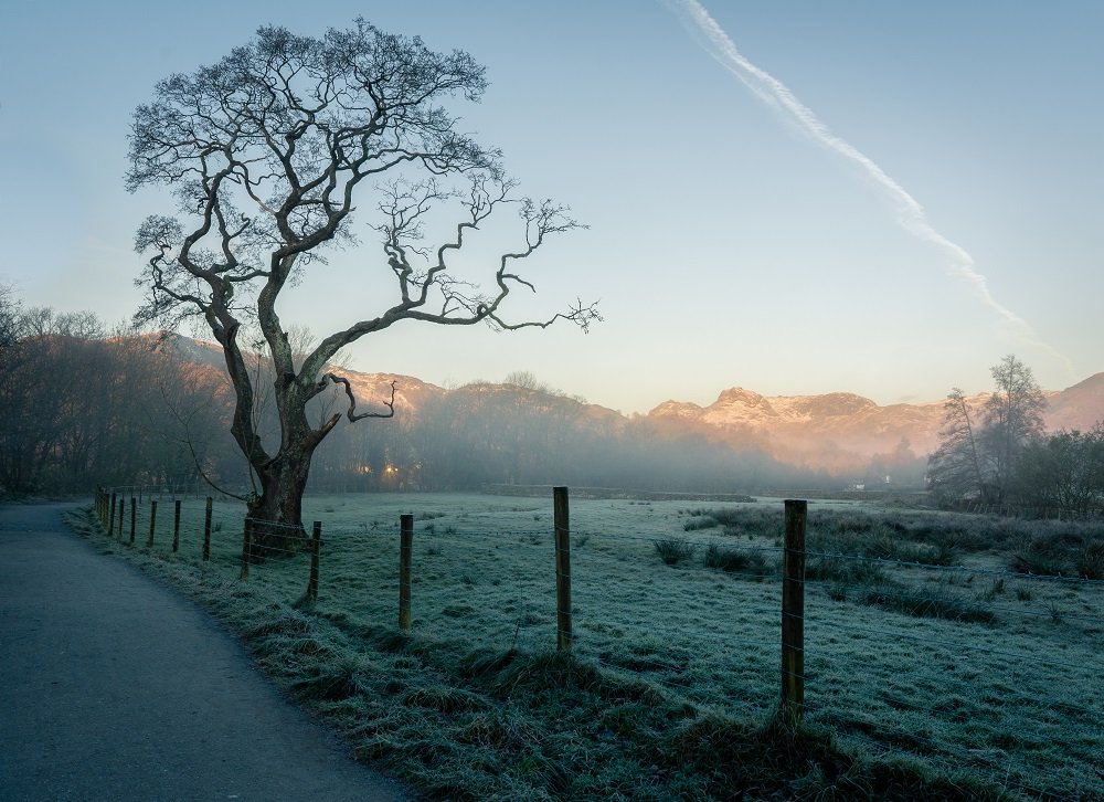
The fenceline and pathway in the foreground make ideal leading lines, guiding the viewer’s eye towards the distinctive tree and the illuminated hills in the background.
When to break it
You can see that leading lines can be incredibly useful in an image, but overuse breeds an over reliance, and using them in every composition quickly leads to boring and repetitive images. In some cases, trying to utilise a leading line can actually be detrimental.
You Might Like… Ultimate Guide to Landscape Photography Pt 1
For example, we’re often told that we shouldn’t use horizontal lines in our images due to it ‘breaking up the image’. However, the use of horizontal lines is a great way to evoke stability and calm to an image. It’s a sort of grounding mechanism that gives the rest of your image a solid foundation and allows the viewer to explore freely.
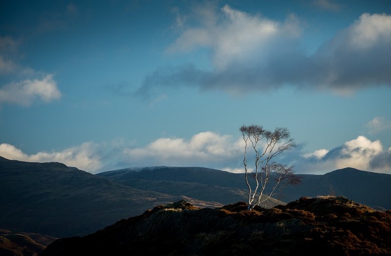
Trying to find a leading line to fit into every one of your shots is a shortcut to predictability. It’s okay to break the ‘rules’, and sometimes you’ll find that these hallowed commandments simply aren’t suitable for certain types of images.
This is perfect for use in a more minimalistic style of photography, when you want your viewer to roam around a largely empty frame before coming to rest on whatever your main subject is. In these instances, use of leading lines can make for a really poor choice. We don’t want our viewer to be led directly to our main subject, instead encouraging them to embrace the large amount of negative space.
Photography Rule #3 – Fill the Frame
What is it?
This is a common saying uttered to beginner photographers, and I can definitely see the reasoning behind it. Advising photographers to ‘fill the frame’ is an attempt to get them to really think about their subject matter and try and draw the viewer’s attention to it. The typical smartphone snap tends to have the vast majority of the frame contributing precisely nothing to the image, with the actual subject of the photo not given enough attention.
By zooming in (or walking closer) you can fill the image with what you actually want to convey, and cut out all the pointless and distracting surroundings. It’s a useful technique to have in your arsenal, but it’s also severely limiting if you think this is the only way to approach composition.
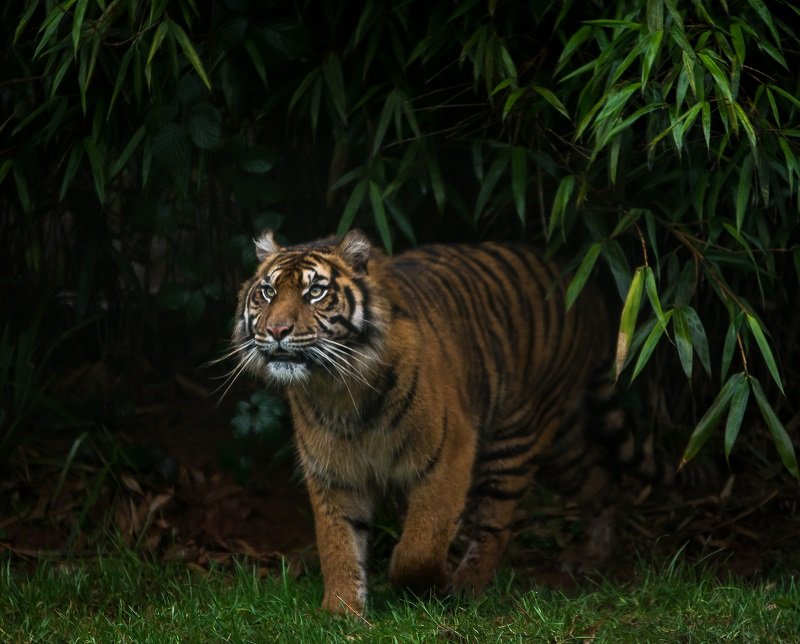
Sometimes, it’s an obvious decision. I wanted all focus to be fixed on that piercing gaze from the tiger, so I went ahead and filled the frame.
When to break it
It’s clear that when your image is all about a certain interesting or emotive subject that filling the frame with that subject is often the best course of action. But what about when you want something a little more introspective or abstract?
Some subjects speak for themselves, like the gorgeous tiger above. However, I find the most emotive and memorable images are the ones that don’t speak for themselves. Instead, they force the viewer to explore the image and find their own little pieces of the jigsaw. What you need for this exploration is space.
Reducing your main focal point to a smaller portion of the frame gives the viewer room to explore, without the image feeling cramped in the slightest. This sort of approach works particularly well with very minimal images, and often lends itself perfectly to a long exposure. These minimalistic scenes also give much more weight to the main subject without the need to fill the entire frame with it, as you can see below.
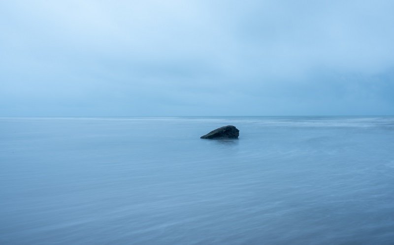
The main focal point in this image is glaringly obvious, despite the fact that it takes up a very small portion of the frame. The minimalist approach gives the viewer room to explore, but keeping that focal point as an ‘anchor’ for the viewer to return to.
The minimal approach isn’t the only way to go about things though. It takes a very skilled photographer, but sometimes it’s possible to create a composition that is both cluttered and very well thought out. This can force the viewer to actively search for the subject, and in the process almost transport them into the world that the image portrays.
Photography Rule #4 – Keep Your Back to the Sun
What is it?
This is perhaps the worst ‘rule of photography’ that there is. The theory is solid as far as the technical aspects of photography go, but as we all know there is much more to photography than the technical side of things.
The reason for shooting with your back to the sun is that it makes your life as a photographer much easier. The exposure in the frame is balanced so there will be no issue with highlight clipping, and with all your subjects being evenly frontlit it negates the problem of shadowy faces that so many beginner photographers struggle with.
Despite this, it’s a rule that I vehemently disagree with.
You Might Like… Natural Light – Types of Light and How to Use Them
When to break it
Obviously I’m not saying that you shouldn’t shoot with your back to the sun, but if you limit yourself to this approach you’re missing arguably the best opportunities just for the sake of an easier life.
In my opinion (and most others I might add), front light is the most boring type of light. It offers limited depth, even more limited tonal contrast, and just lacks the interest that other types of directional light offer.
Think about your favourite images.
How many of them were evenly lit with the photographer’s back to the sun? If you’re anything like me, the answer will be very few indeed.
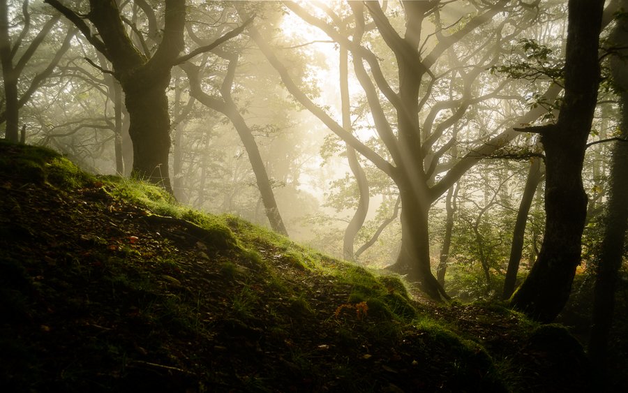
Did I have to work harder to get the exposure correct for this backlit shot? Yes.
If I could go back in time, would I turn around so the sun was on my back and I could get a more balanced lighting setup? Not on your life.
By following this rule you miss the very best opportunities for your shots, and it doesn’t matter which genre you work in. Back lighting (sun in front of you) can give you incredible drama as well as those silhouette shots that are so impressive, while sidelight brings out the form and texture of your subject and offers beautiful transitions from light to dark across the frame.
Front lighting does have it’s moments, but more often than not I prefer to actively seek compositions where the light is doing more interesting things. I would much rather work harder to get that once in a lifetime shot than take the easy road to mediocrity just because I didn’t want to have to figure out how to expose the shot properly.
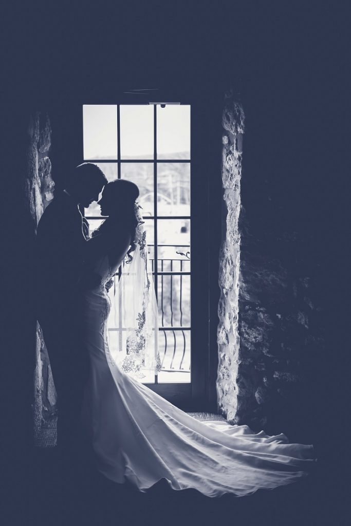
The willingness to break this ‘rule’ should span all manner of photography genres. Would this image be better if the bride and groom were evenly frontlit with every part of the image perfectly balanced in it’s exposure? In my opinion, not even in the slightest.
Photography Rule #5 – Always Shoot in the Golden Hours
What is it?
This is one of the first rules any newcomer to landscape photography learns, and one that is often transcribed across to outdoor portraiture, wildlife, and basically any type of outdoor photography.
The premise is simple – Landscape photographers should conduct all their image making activities in the so-called ‘Golden hours’. How to define the Golden Hour varies between person, season, and various other conditions, but a good rule of thumb is that they refer to the hour after sunrise and the hour before sunset.
And why is it such a widespread rule? Well, because it’s a damn good rule as far as rules go!
It’s a fantastic way for the newcomer to photography to learn the important of light and how the right light can turn a good photograph into an incredible one. If you have never tried shooting in the Golden Hour, I would urge you to do so.
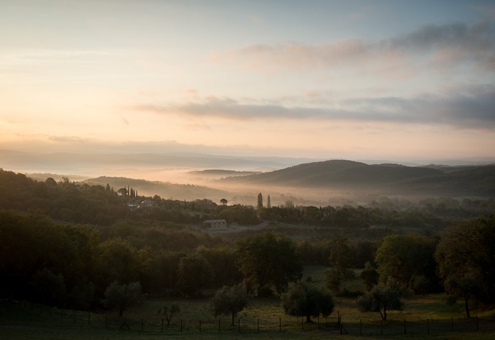
If you’re going to limit yourself to a certain time of day for photography, you can do much worse than the Golden Hour. However, limitations are, by their very nature, restrictive.
When to break it
As always, we break the rules when they begin to limit our photography, and there are an awful lot of photographers limiting themselves with this rule. I’m not even talking about beginners and newcomers either – There are some professional and world-renowned landscape photographers who rarely, if ever, shoot outside of the Golden Hour.
Is that such a bad thing? Well, yes and no.
I guess if you’re going to limit yourself to a certain time of day, then the Golden Hours are absolutely the best time to limit yourself to. Personally, I don’t feel like we should be limited at all.
I’m not going to lie and pretend that I wasn’t one of those people. I would only venture out at sunrise and sunset, and only if the cloud cover forecasts promised a nice colourful sky.
The result? A lot of very nice images of sunsets and sunrises. A lot of photos very similar to those that many other photographers are producing. A lot of abandoning photography shoots because the weather wasn’t right. Very little in the way of originality.
Eventually, through no real conscious decision, I shed this limitation that I’d placed on myself. I still do most of my photography work in the early hours of the day, but I’m not obsessing over weather reports or abandoning ship if the fiery sky doesn’t materialise.
You Might Like… Forget Rainy Days – Here’s Why You Should be Photographing in Bad Weather
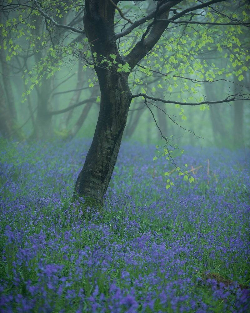
Early on in my photography adventure I would have looked out of the window and got straight back into my warm, cosy bed on this drizzly spring morning. I didn’t though, and came away with one of my favourite images of the year.
Instead, if I plan a shoot I’ll head out whatever the weather. Sometimes I come up empty handed because the conditions just weren’t working, but even on those occasions I’ve still had a lovely morning embracing nature.
Trying to find compositions that work and making the most of the conditions has undoubtedly made me a better photographer than I was, and as I look around my office walls I notice that the framed prints that I’ve chosen to hang aren’t chocolate-box sunsets – They’re taken in conditions that I would never have even gone out in.
Shooting in ‘bad’ weather has brought some originality to my photography, and it’s enjoyable to challenge yourself to make a good image even in less than ideal conditions.
You Might Like… Photography in the Rain – Making the Most of a Rainy Day
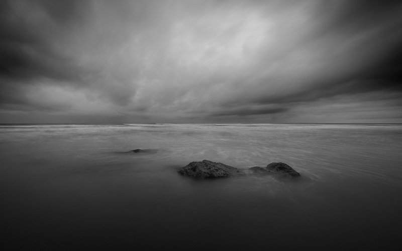
There was no hope of light breaking through and a colourful display in the sky on this afternoon, but that didn’t matter to me.
Photography Rule #6 – Rule of Odds
What is it?
The rule of odds is another photography rule that has it’s basis in solid scientific theory. It states that things are more visually appealing when there is an odd number of subjects rather than an even number, and once again it’s a guideline that is very useful most of the time.
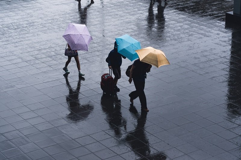
For example, if you can, try to imagine the above image with only two people walking along holding their umbrellas. Simply put, it just wouldn’t look as good as it does with three. It’s related to the way that humans attempt to create triangles in the scenes that they see, which is our way of forming relationships. It’s much easier to form a triangle with three subjects rather than two!
When to break it
There are very, very obvious situations where you can break this rule, most notably in situations such as wedding or engagement shoots. After all, it’d be pretty weird to have a random and awkward looking third-wheel in an otherwise intimate wedding portrait.
These situations cover the real reason that we don’t need odd numbers in all of our shots though – Relationships. I mentioned above that we try to form relationships between subjects in images we see, and that triangles are a big part of that.
Sometimes a triangle isn’t necessary to see a clear relationship though. The image below certainly doesn’t need a third figure to make that relationship apparent, and unless that extra subject was the man’s other son it would almost certainly detract from the image.
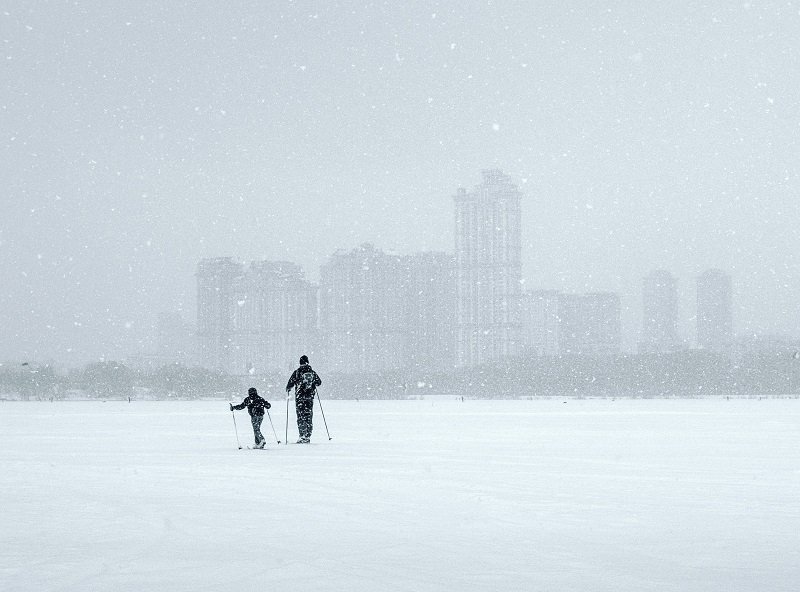
Unless the third subject in this image were the man’s other son, trying to follow the rule of odds here would almost certainly result in a worse photograph.
Photography Rule #7 – Don’t Blow Highlights / Clip the Shadows
What is it?
Yet another rule, like so many of them, that it is generally advisable to follow. This is simply a way of telling beginner’s not to overexpose/underexpose their images, and it’s something that we all need to take care of sometime.
Basically, the histogram on the back of our camera and/or back in post-processing displays all the data to tell us whether our image is too bright, too dark, or just right. You can read more about how to read a histogram in our Ultimate Guide to Landscape Photography here.
Most of the time we want all of the data to fall between the edges of the histogram. Anything pushed off the right side is referred to as the highlights being blown, and anything to the left is shadow clipping. What this means is that absolutely no data is recorded here, no matter how much editing you do.
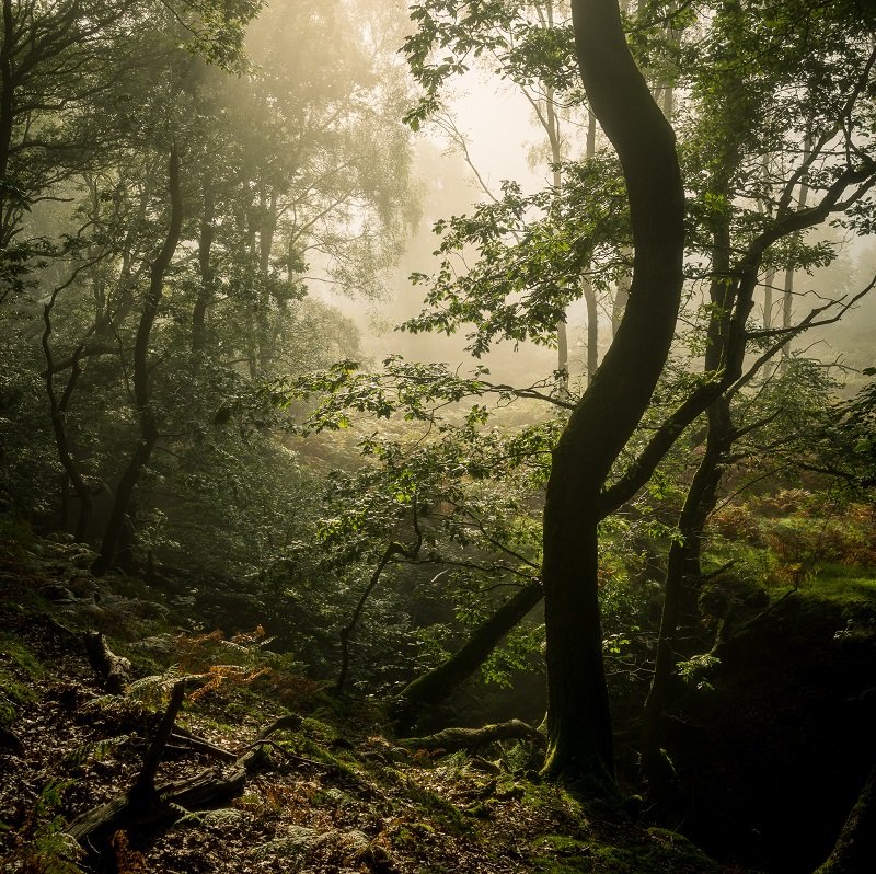
The problem is that the camera sensors, as good as they may be in this age, are nowhere near the level of a human eye when it comes to dynamic range. Often this means that we are simply unable to record both the deepest shadows and brightest highlights, and have to resort to exposure bracketing or graduated neutral density filters. The image above is a situation where I did want to record all the detail, so I did an exposure bracket to capture it all.
When to break it
Most photographers are absolutely desperate to get all that data in the image, and that’s exactly what caused the gaudy HDR craze that swept the photography world a few years ago.
What these photographers forget is that you can actually get complete blackness and whiteness in real life. Our eye doesn’t pick up detail from the sun, or from the deep shadows inside a cave. Often, there is no need to go to these extreme lengths to try and record detail here, and it results in an unnatural looking image.
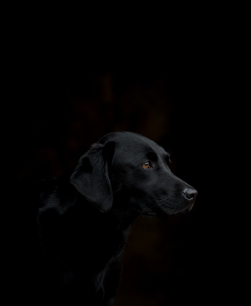
Contrast is good, and if that means blowing the highlights or clipping the shadows once in a while then I’m more than willing to do it. Take the image below – I’ve clipped the shadows enormously to get the effect that I wanted. In fact, the vast majority of the image has no data at all in there, and it’s exactly what I wanted.
Photography Rule #8 – Always Get the Eyes in Focus
What is it?
You guessed it – Another rule that you really should follow most of the time. The eyes are the window to an animal or human’s heart, and getting them in focus is almost always recommended.
You Might Like… 10 Tips to Take Your Pet Photography to the Next Level.
It allows the viewer to connect with that subject, and it’s the very first place that your eyes travel to when viewing an image for the first time. If the eyes are even a little bit out of focus it will be obvious.

For the majority of your shots, you will want the eyes to remain in sharp focus.
In fact, one rule you can always follow is to never just slightly miss the focus of the eyes. It’s a story of two extremes – Either get them pin sharp or make it obvious that the eyes aren’t supposed to be in focus.
When to break it
Sometimes, the eyes aren’t what you want the viewer to be focusing on (pun, again, intended). Something more interesting might be happening, and by using a shallow depth of field you can draw the attention towards that.
It’s definitely worth experimenting with, rather than instantly and automatically locking focus onto the eyes. Remember though, make sure that it’s very clear that the eyes are supposed to be blurry!

The subject of this image is about the relationship between the human feeding their dog, and as such that moment of contact being in focus is more impacting than the eyes behind being sharp.
Photography Rule #9 – Landscapes Must be Sharp Front-to-Back
What is it?
This is a common rule that is preached to everybody who is just starting out in landscape photography.
The tutors and camera club judges throw a sweeping statement out there that everything in a landscape photograph should be in focus. Front-to-back sharpness is the fabled holy grail of many a newcomer to landscape photography.
They stop down to f/22 for every image (beware light diffraction!) and think that that is the essence of landscape photography. But it’s not.
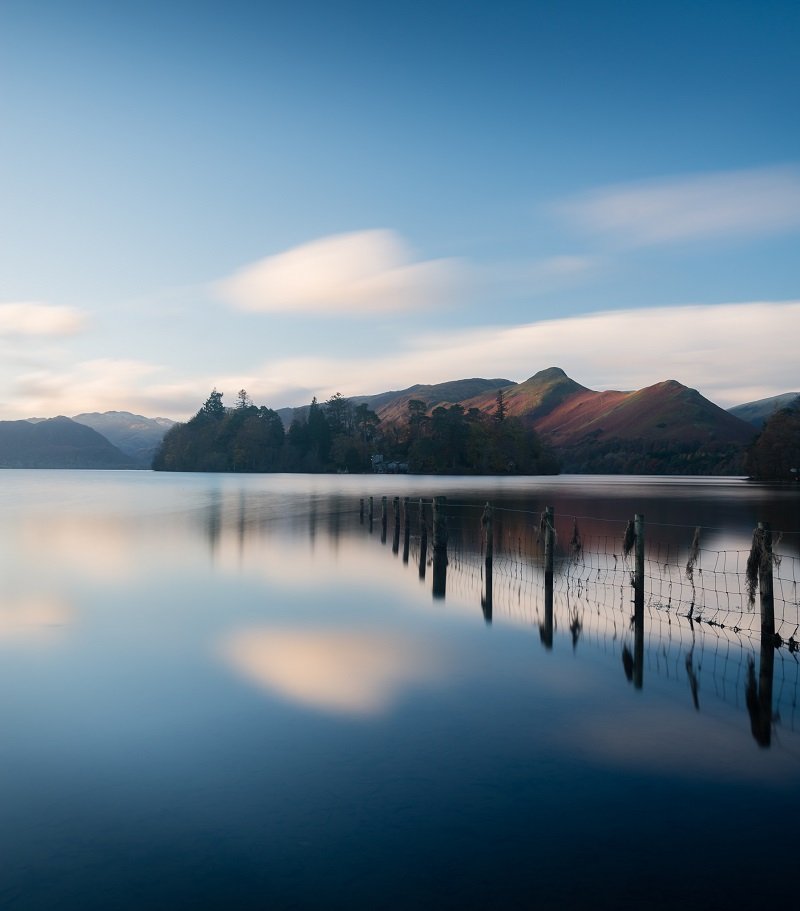
Often, we do want our landscapes to be sharp all the way through. I definitely needed the fence in focus here, but having the hills in the background blurry wasn’t acceptable either.
Admittedly, most traditional landscape images can benefit from having everything in focus. If you’ve got a clear view out to the distance then getting everything sharp is something to aim for, but it’s by no means something that should be followed all the time.
When to break it
Things aren’t always sharp and in-focus in life. Subjects can appear blurry in our peripheral vision, or something could be obscuring the fine detail of something in the distance, and this is all completely fine to portray in a photograph.
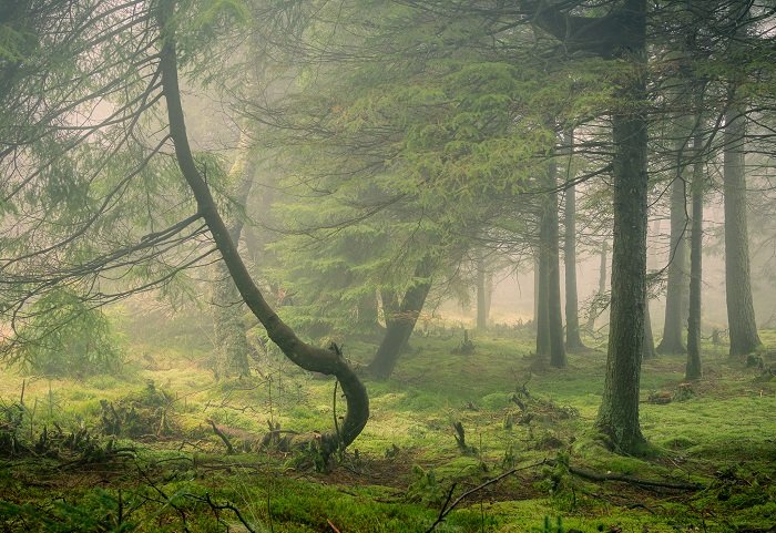
Often, a landscape image can be significantly enhanced by keeping a sense of mystery. That’s why landscape photographers love misty and foggy conditions so much! The mist obscures part of the landscape, so why on earth would you want to try and make it tack-sharp?
We want to try and accentuate this mystery, and we can do so by purposefully using a shallow depth of field. Take the image below, for example. It was taken in drizzly, foggy conditions in a gorgeous, almost primordial section of woodland. I wanted to enhance the mystery, so I used f/5.6 to further throw the background out of focus.
Photography Rule #10 – Keep Your Camera Still
What is it?
It’s sort of Photography 101 right? Keep the camera stationary while taking a photo.
I’m guessing that, for the most part, you’ll want to follow this most basic of photography rules. If you don’t all you end up with is a bunch of blurry shots of subjects that really should be sharp.
When to break it
However, to be truly creative you have to think about breaking even the most ingrained of rules, and moving the camera while taking a photo can create some very interesting images.
The technique is called Intentional Camera Movement (ICM), and is done by purposefully moving your camera in a specific way while the shutter is open. It often works best with slightly longer exposures than usual, such as a second or two.
It’s a very difficult technique to master, and will undoubtedly result in you deleting the vast majority of the photos you’ve taken. However, those rare occasions when it pays off are well worth it. You’ll end up with a beautifully abstract image that can convey mood, atmosphere, and movement.
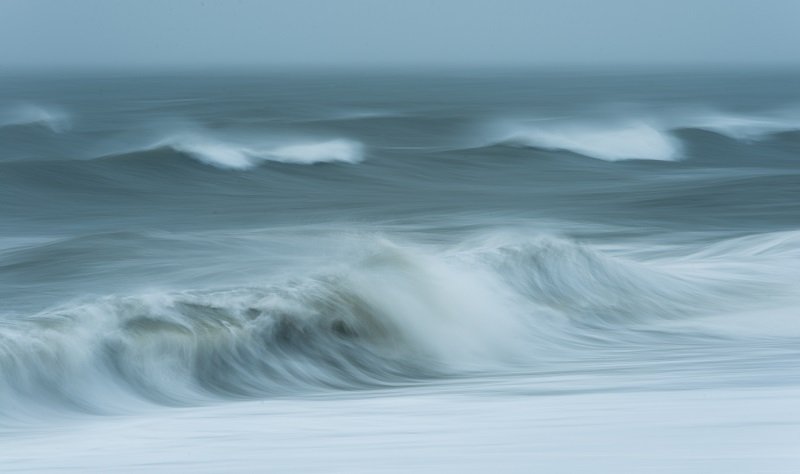
Here, I panned the camera along at the same speed as the wave and used a shutter speed of around one second, enhancing the sense of movement and creating a more abstract take on the incoming tide. This is a mixture of panning and ICM.
ICM is mainly used to create abstract shots, but you can also use a technique called panning. This is where you track along at the same speed as your (moving) subject while the shutter is open. Again it takes a lot of practise and trial and error, but the result will be a perfectly sharp subject and a blurred background that perfectly illustrates the speed of the scene.
You Might Like… Ultimate Guide to Waterfall Photography
Photography Rule #11 – Landscape Photography Needs Foreground Interest
What is it?
This, along with the rule of thirds, is one of the first things taught to budding landscape photographers. It’s another one of those that is very helpful for beginners, and more often than not it is the route to go down with your photography.
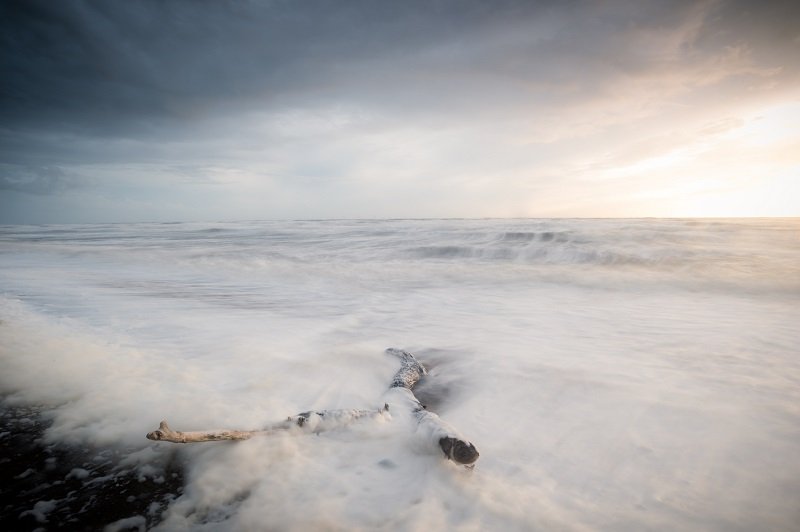
Here, I deemed that this washed up piece of driftwood was the perfect foreground subject to include. It created interesting patterns in the receding waves and had enough character of it’s own to be worth an image.
The idea is that adding incorporating a foreground element into your image enhances the sense of depth in the scene. This is obviously very important, because we’re trying to convey a three dimensional scene on a two dimensional medium. More often than not, a feeling of enhanced depth by using foreground interest is something we want to achieve.
When to break it
As always, when it starts to become predictable and stale. Far too many newcomers to landscape photography get tied up in the rule of thirds and the perceived need for a foreground subject. This results in a litany of images taken with an extremely wide angle lens, with a foreground subject placed in one of the lower thirds. Basically, it’s predictable and can be dull.
Actually thinking about whether a foreground subject would enhance your image or not is important if you’re going to break the rules. Take the image below, for example. This is all about the perfect reflection and subdued, minimalistic colour palette. Adding a foreground element here would ruin the feeling of calm and symmetry that I was trying to convey.
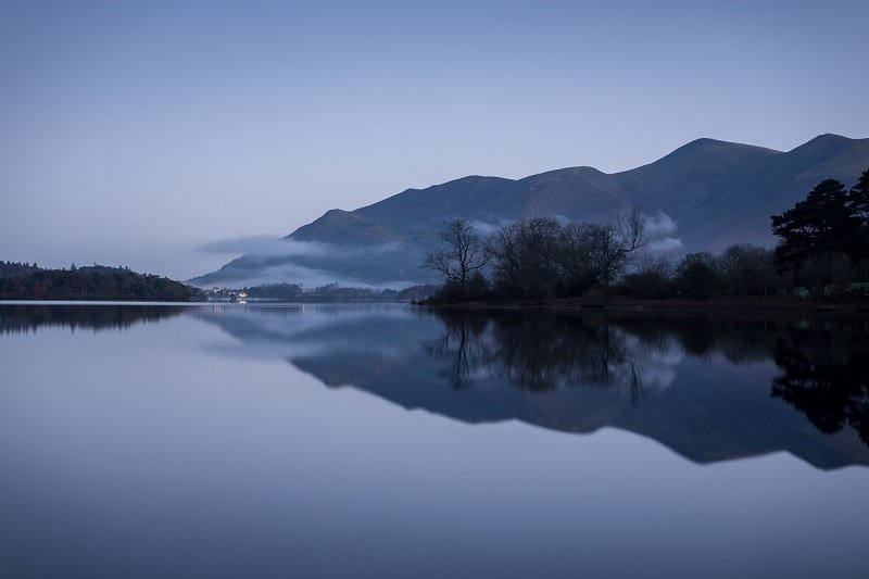
The same is true of all minimalist landscape photos. Before you start hunting around for any half-acceptable piece of foreground interest ask yourself – Will this image really be improved by it?
Often, an image is enhanced by taking something out of the equation and simplifying, rather than striving to find something to add to it.
Photography Rule #12 – Don’t Centre the Subject
What is it?
Fairly closely related to the rule of thirds, the rule to never put your subject in the centre of the frame is another one that is drilled into all newcomers to photography straight away.
Again, there’s a good reason behind this. The vast majority of people, when taking a photo, simply whip their smartphones out, put whatever they’re photographing right in the middle of the frame, and snap it. Thoughtful composition is what sets us apart from the rest of the world as photographers, and more often than not our image will work better with the subject off-centre.
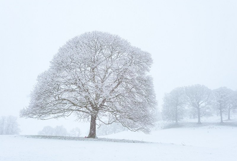
The slight lean of this tree and the nicely positioned background trees made this a clear cut decision to go with the norm and place my subject off-centre.
When to break it
There are plenty of times when we need to just flat-out ignore this rule. For example, when photographing reflections we’ll often want the horizon centred, and if we’re doing some minimalistic work with a single main subject it’s well worth considering placing it dead centre of the frame.
You Might Like… DSLR or Mirrorless – Which Camera System is Right for You?
There are countless examples across all genres of photography where a centred subject works better than an image following the rule of thirds. Anything related to symmetry is worth testing out, as is any time where you have converging lines (think roads or railway lines).
It can even work in portrait photography too. If you have a subject perfectly centred and staring directly into the lens it can create a piercing connection between the model and the viewer.
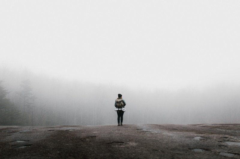
This is a very minimal type of environmental travel photograph, and placing the subject centrally in this situation is certainly the best choice in my opinion. Anything off-centre would imbalance the entire scene.
Closing Thoughts
There is no concrete formula for becoming a good photographer. Newcomers to this wonderful hobby are bombarded with these ‘rules’ of what you can and cannot do with your images, but since when do we attach such steadfast rules to art?
Granted, many of these so-called rules are very useful to know (not all of them though. I’m looking at you, number 4). They’re great as guidelines for how you could improve your photography, but portraying them as these rules that all must follow is quite a damaging thing for a photographer.
It took me a long time to realise that these rules weren’t applicable in every situation, and once I realised that my creativity in compositions increased massively! Break out of the habit of thinking that you should do something, and instead realise that you can do whatever you want!
Photography is a creative pursuit, and trying to define creativity by rules is never wise.
Read More…
29 Perfect Gifts for Photographers – The Photographer’s Wishlist
Forest Photography Lightroom Presets
The Ultimate Guide to Autumn Photography
Best Cameras for Landscape Photography
 |
 |
 |
 |

About Alex W.
Alex is the owner and lead writer for Click and Learn Photography. An avid landscape, equine, and pet photographer living and working in the beautiful Lake District, UK, Alex has had his work featured in a number of high profile publications, including the Take a View Landscape Photographer of the Year, Outdoor Photographer of the Year, and Amateur Photographer Magazine.
Thoughts on "Tearing up the Rulebook – 12 Photography Rules and When to Break Them"
 |
 |
 |
 |
You can Get FREE Gifts. Furthermore, Free Items here. Disable Ad Blocker to receive them all.
Once done, hit anything below
 |
 |
 |
 |