5 More Photography Composition Tips
by Alex W.
We covered how important composition is in photography in our Beginners Guide to Composition, but in all honesty we only covered the tip of the iceberg in that article. The limits are endless and the theories countless, so we're back again to continue advancing your knowledge of composition.
If you haven't already, it's advisable to take the time to read our beginners guide before advancing to this article.
Contents
1. Balancing the Image
We went over the rule of thirds in the previous article, but it's important to use that tool with great care to avoid creating an unbalanced scene. It's very easily done.
Say you've come across a lovely subject and a great background as well, but if both of these points of interest are on the same side of the frame the whole composition becomes unbalanced and weighted towards one side. We often want to avoid that and create a more balanced aesthetic, and the way to do that is to utilise perspective very carefully and ensure we don't have unwanted empty space dominating one area of the photograph.
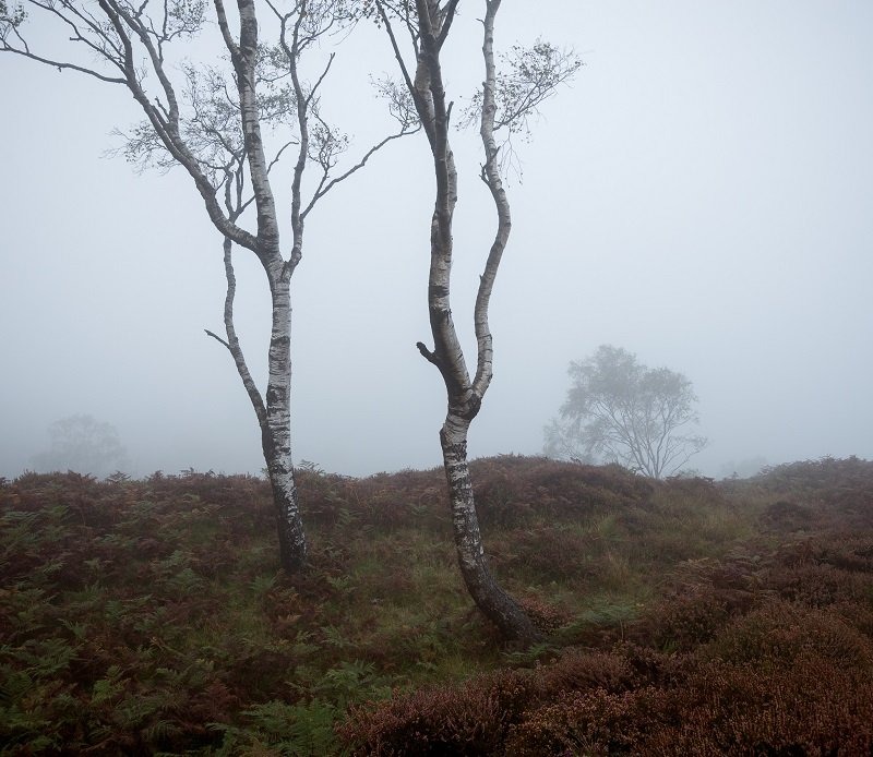
Take the image below for example. I call this image 'The Dancers' because the two foreground silver birches were intertwined like dancers, but my first composition felt a bit off. It was because everything was happening on the left hand side of the frame, so to solve this I moved to the left slightly and incorporated the mist-shrouded background tree to balance the composition out.
2. Creating a Sense of Depth
I touched upon this in my landscape photography tips article, but it applies to all genres of photography. The absolute biggest challenge we face as photographers is conveying a three-dimensional scene in a two-dimensional medium. This is where the vast majority of photographers fall flat, which is ironic because that's exactly how the images look without a sense of depth.
How do we combat this? Well, in landscape photography we tend to utilise foreground material to create a scene with a foreground, mid-ground, and background, which takes the viewer through the scene. This isn't as applicable in other areas of photography though, so we have to utilise some other techniques.
Probably the most widely used and helpful is using a wide aperture to separate your subject from the surrounding areas. This, as you know from The Exposure Triangle, renders the out of focus areas as a smooth blur, and that separation of the main subject and the background/foreground adds a sense of depth into the image.
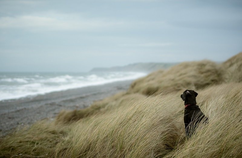
The image below uses a number of techniques to create depth. Firstly, the gorgeous Black Labrador (not biased obviously) is very useful as a main focal point and piece of foreground interest, but to add to that I used a wide aperture to throw the coastline out of focus and add to the feeling of depth and distance.
3. Fill the Frame
Now this isn't a technique to use all the time, but in certain situations it can be a very good way to draw attention to the main subject in your image. It works especially well in intimate scenes, portraits, and wildlife photography when focusing on a certain detail within the frame.
For example, if you were photographing a portrait where a man's eyes were startlingly bright you might try honing in on his face to draw attention to these bright eyes, making sure the frame was completely filled with his face.
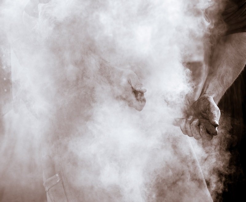
This technique can also be used to retain a sense of mystery in your image and keep the viewer intrigued for that little bit longer. That's what I was doing with the image below, which shows a close-up of a farrier at work shoeing a horse. We don't need to see any other part of the farrier to know what is going on, and the plumes of smoke obscuring everything but his hands add a sense of mystery to the whole scene.
4. Use Triangles and Diagonals
This is related to a couple of guidelines I mentioned in the previous post, leading lines and the rule of odds. Those two might seem very simple, but they can actually be used in much more advanced ways to improve the composition of your image.
Triangles and diagonal lines add a sense of dynamism to your photos and create a relationship between the points of these triangles. Horizontal and vertical lines are often seen to portray stability and strength, whereas diagonals portray a sense of instability instead, which indicates a dynamic environment. It might sound pretentious and arty, but it's backed up by science!
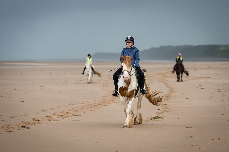
The image below shows how triangles can be used to link subjects together. Once you've seen the main foreground subject your eyes are instantly drawn to the background horses and then circle back around.
5. Simplify the Scene
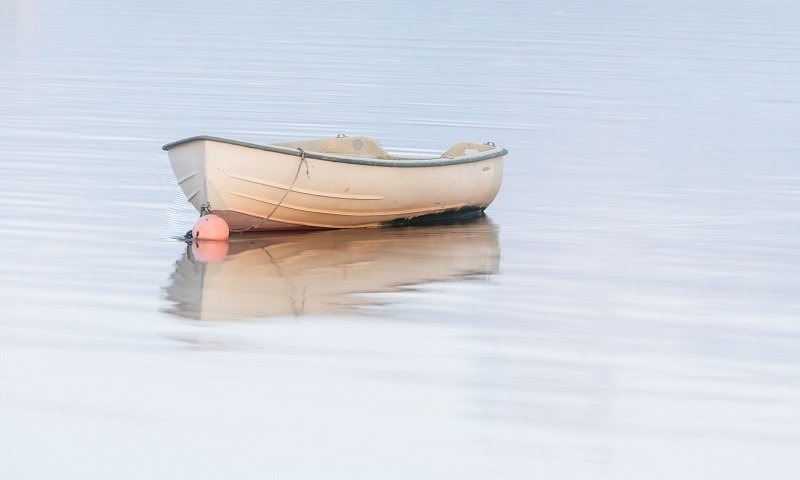
This is a similar sort of tip to number 3, in that we're trying to boil the scene down to it's most attractive aspects and eliminate everything else. It's often said that the difference between a painter and a photographer is that a painter's job is the add elements to an image, whereas a photographer is required to eliminate all the unnecessary clutter.
All of the best images I remember are those that are as simple as they can possibly be, with no needless distractions or cluttered background. When shooting a scene just focus on what you like most about it; what drew you to take a photograph in the first place? Once you've determined that try to eliminate everything else and see what you're left with.
The image below is a prime example. It was a gorgeous sunset on the coast, and this boat reflected on the calm waters of the estuary drew my attention immediately. So I ignored the sunset and focused all my attention on the boat. I came away with a beautifully simple image that conveyed my emotions precisely. Eliminate all that is unnecessary and the elements that are included become all the more important.
Read More
- Ultimate Guide to Landscape Photography Pt 1
- Best Entry Level DSLR Cameras
- DSLR vs Mirrorless - Which One Works for You?
- 5 Must Buy Lenses for Nikon DSLRs
 |
 |
 |
 |

About Alex W.
Alex is the owner and lead writer for Click and Learn Photography. An avid landscape, equine, and pet photographer living and working in the beautiful Lake District, UK, Alex has had his work featured in a number of high profile publications, including the Take a View Landscape Photographer of the Year, Outdoor Photographer of the Year, and Amateur Photographer Magazine.
Thoughts on "5 More Photography Composition Tips"
 |
 |
 |
 |
You can Get FREE Gifts. Furthermore, Free Items here. Disable Ad Blocker to receive them all.
Once done, hit anything below
 |
 |
 |
 |